Overview
The Windcave Hosted Fields solution is a client-side JavaScript (JS) library which utilizes the AJAX POST functionality and enables merchants to customize the UI for accepting payments on their checkout page with their preferred layout and styling, while maintaining PCI compliance.
As the interaction between end user and Windcave is controlled through iframes and cardholder data is input directly into the iframe managed by Windcave; merchants using the Hosted Fields solution qualify for PCI SAQ A.
For detailed information about Hosted Fields and its customizable features, please review the page below.
Pre-requisites
Below outlines the pre-requisites required to implement the Hosted Fields solution.
To get started with your Windcave Hosted Fields integration you will need a REST API account, please sign up for an account, or contact us and complete the requirements gathering form to request development credentials.
Once signed up, our team will create development credentials based on the requirements provided in the above form. We will provide a API username and API Key; both of which must be securely transferred and stored on your web-server.
Supported Browsers
This table outlines the currently supported Web Browsers and versions:
| Browser | Version |
|---|---|
| Chrome | 70+ |
| Edge | 80+ |
| Firefox | 90+ |
| Internet Explorer | 11 |
| Opera | 85+ |
| Safari (iOS/MacOS) | 12+ |
Content Security Policy
The Windcave Hosted Fields solution is very dynamic and may load various resources to ensure the payment checkout functions as expected.
To ensure everything is able to load correctly, merchants may need to include additional Content Security Policies (CSP) to prevent blocking of necessary resources.
Outlined below are the basic directives to be whitelisted:
| Directive | Production (SEC) | User Acceptance Testing (UAT) |
|---|---|---|
| connect-src | https://sec.windcave.com | https://uat.windcave.com |
| font-src | https://sec.windcave.com/fonts/ | https://uat.windcave.com/fonts/ |
| img-src | https://sec.windcave.com | https://uat.windcave.com |
| script-src | https://sec.windcave.com/js/ | https://uat.windcave.com/js/ |
| style-src | 'unsafe-inline' | 'unsafe-inline' |
| frame-ancestors | https://sec.windcave.com | https://uat.windcave.com |
Implementing Hosted Fields
As Hosted Fields works in conjunction with Restful API, the merchant needs to create a new payment session using a Restful Create Session request.
Below is an example of the Create Session response:
For more detail on available session objects, please refer to the Windcave Rest API.
Restful API Create Session response
          {
            "id": "00001200002116585f8d891123456787",
            "state": "init",
            "links": [{
              "href": "https://sec.windcave.com/api/v1/sessions/00001200002116585f8d891123456787",
              "rel": "self",
              "method": "GET"
            }, {
              "href": "https://sec.windcave.com/pxmi3/F0AD7308709093294215B271C6E087134C33EB015769FCFBA5322EE8F69378EB1D895FD231D9A10C116A6DA19F34F460A",
              "rel": "hpp",
              "method": "REDIRECT"
            }, {
              "href": "https://sec.windcave.com/pxmi3/F5A2BEDE53131E04066A068518F8D02BC422773FE5427CE19E05A5472028EABF01AC08C38D6378B26B6FD68134DCC0FBD",
              "rel": "seamless_hpp",
              "method": "REDIRECT"
            }, {
              "href": "https://sec.windcave.com/pxmi3/F02CBA539AA694D6ECDEA85D44CCE23679B11B3ADEAE7484F34E591DF44D96E0ADC35F47CFD7AC50F0C10805AE08D964C",
              "rel": "submitCard",
              "method": "FORM_POST"
            }, {
              "href": "https://sec.windcave.com/pxmi3/F6AF0F75C5EE172E1E6C29B4AAF60023A48BFA2103B78F50DF414F5D93902847D7DAF157683429F15E53995AC645D5DA1",
              "rel": "paymentMethod:paypal",
              "method": "REDIRECT"
            }, {
              "href": "https://sec.windcave.com/mh/F105F622A16AA024CCCC4D7BCF4077B687C8E180886CF76C4DEB488635298070089E907543745D2BB7B60845E9C6BED34",
              "rel": "ajaxSubmitCard",
              "method": "AJAX_POST"
            }, {
              "href": "https://sec.windcave.com/mh/FA0F72460E5A7D66289271BBD5E7F625EE767DC8A0FEE92E8E24496D8E0C20BC3E6601EE2D2CF7E9F3074F6515D131923",
              "rel": "ajaxSubmitGooglePay",
              "method": "AJAX_POST"
            }, {
              "href": "https://sec.windcave.com/mh/FBA081BB5FC6805CD9DC88DA56A14020B01492B1C4ED273452DF9E668BD9334E07ED370DD3E7F10B007C0820A79DE415D",
              "rel": "ajaxSubmitApplePay",
              "method": "AJAX_POST"
            }
            ]
          }
Note: Hosted Fields does not require the session to be created immediately; it can be deferred to the point of submission if the merchant chooses.
JavaScript Files
In order to implement Hosted Fields into the payment checkout, merchants need to load the Windcave JS files onto the <head> element of the checkout page:
             <script src="https://sec.windcave.com/js/lib/hosted-fields-v1.js"></script>
             <script src="https://sec.windcave.com/js/windcavepayments-hostedfields-v1.js"></script>
To improve the page loading times, these scripts can be safely marked as async or defer per the below example:
             <script async src="https://sec.windcave.com/js/lib/hosted-fields-v1.js"></script>
             <script async src="https://sec.windcave.com/js/windcavepayments-hostedfields-v1.js"></script>
Page Layout
Hosted Fields allows merchants to define the layout and styling of their checkout page; to prepare this, the merchant needs to prepare for the Hosted Fields elements.
Each individual card form element must have its own container therefor containers that are provided are dependent on the use case.
If using one-off / initial card tokenization the minimal set of fields must include:
- Card Number
- Expiry Date
- Components can be separated if required:
- Expiration Date - to capture MM/YY in a single field
- Expiry Month + Expiry Year - to capture expiry month and expiry year in separate fields
- Components can be separated if required:
For Rebilling, an additional verification CVV can be included.
Supported Fields for Hosted FieldsBelow are the full set of fields currently supported by Hosted Fields:
- Card Number
- Expiration Date
- Expiration Month
- Expiration Year
- CVV
- Cardholder Name
- Billing Street Address 1
- Billing Street Address 2
- Billing Street Address 3
- Billing City
- Billing Country
- Billing Postal Code
- Shipping Street Address 1
- Shipping Street Address 2
- Shipping Street Address 3
- Shipping City
- Shipping Country
- Shipping Postal Code
Hosted Fields Examples
Below is a simple example of the Hosted Fields solution for demonstration purposes only; integrations are not required to follow this design/format.
Merchant is using Bootstrap 4 and wants to accept the payment on their checkout page. This example uses only Card Number, Cardholder Name, Card Expiry and CVV in a 2x2 grid (or a single column on a smaller screen):
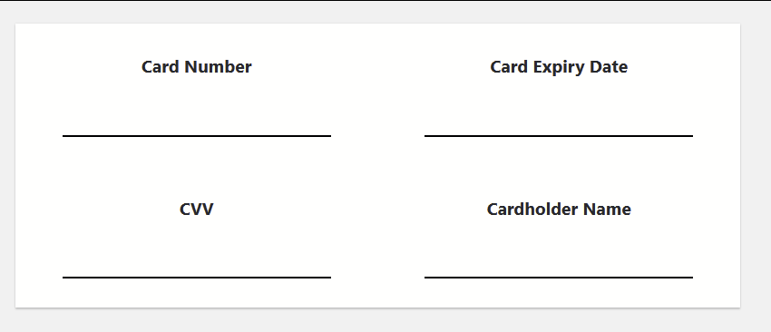
The following markup is used for the example above:
Sample code
          <div class="container panel">
            <div class="row">
              <div class="centered col-lg-6">
                <p>Card Number</p>
                <div class="field-container" id="number-div"></div>
              </div>
              <div class="centered col-lg-6">
                <p>Card Expiry Date</p>
                <div class="field-container" id="expiration-date-div"></div>
              </div>
              <div class="centered col-lg-6">
                <p>CVV</p>
                <div class="field-container" id="cvv-div"></div>
              </div>
              <div class="centered col-lg-6">
                <p>Cardholder Name</p>
                <div class="field-container" id="cardholder-name-div"></div>
              </div>
            </div>
          </div>
The field-container CSS class is Windcave's custom class that adds padding and a dark bottom border
Sample CSS
          .field-container {
             border-botton: 2px solid #000;
             padding: 6px;
             display: inline-block;
             width: 80%;
             height: 48px;
          }
Creating Hosted Field Components
Once all JS files have been loaded, the REST Session created and the layout has been defined, the next step is to create the Hosted Fields component for the checkout page.
To do this, the merchant needs to call the WindcavePayments.HostedFields.create method, this method returns a Hosted Field controller that should be stored in a variable for future use.
The interface of the WindcavePayments.HostedFields.create method is as follows:
WindcavePayments.HostedFields.create(options, loadTimeout, onSuccess, onFailure)
Where:
- options is a JS object that contains settings for the Hosted Fields component (details in the next section)
- loadTimeout is a time in seconds the Hosted Field constructor will wait for all the components to notify of their successful initialization before giving up. 'null' can be entered to give elements the time it takes to construct, in place of a finite value.
- onSuccess is a callback that is triggered when all the Hosted Fields elements are successfully constructed.
- onError is a callback that is triggered when constructing of any of Hosted Fields elements has failed. This calledback gets called with two parameteres - stage and errorMesseage. Currently the only acceptable value for stage the merchant can expect is setup.
options Object
This object has a variety of different fields that can be included, some fields are required while others are optional:
Required Fields| Field Name | Description |
|---|---|
| fields | The subobject containing the configuration for Hosted Fields elements |
Optional Fields:
| Field Name | Description |
|---|---|
| env | The environment the Hosted Fields should work with. Default value is sec
Possible values are:
|
| styles | Subobject used to define styles to apply to the Hosted Fields elements |
| threeDsIFrame | Subobject used to define settings for the 3D Secure iframe |
options.fields subobject
The subobject defines the configurations for the Hosted Fields elements. Available fields are:
- Card Number
- ExpirationDate
- ExpirationMonth
- ExpirationYear
- CVV
- CardholderName
- BillingStreetAddress 1
- BillingStreetAddress 2
- BillingStreetAddress 3
- BillingCity
- BillingCountry
- BillingPostalCode
- ShippingStreetAddress 1
- ShippingStreetAddress 2
- ShippingStreetAddress 3
- ShippingCity
- ShippingCountry
- ShippingPostalCode
options.fields.* subobject
Listed below are common fields available across all fields subobjects:
| Field Name | Description |
|---|---|
| container | Holds an ID of the element container |
| placeholder | Defines the input placeholder when no entry was input into the field |
| disableAutoComplete | Specifies whether the field auto-completion should be disabled. If this option is omitted, the input element will be constructed with auto-completed on. |
| tabOrder | A numeric value that defines the order of the element in the Hosted Fields set. |
| validationHandlers | The subobject holding callbacks for field validation events. Available callbacks are:
|
| eventHandlers | The subobject holding callbacks for different non-validation events:
|
| length | The object defined settings for the input related to the length of the input:
|
| styles | The subobject defining the styling parameters for the input. This overrides the global style if one was provided. |
options.fields.CardNumber subobject
The CardNumber field allows for additional options as below:
| Field Name | Description |
|---|---|
| cardSchemaImagePlacement | Defines the location for the card brand logo. When omitted or the value is an empty string, there will be no logo. Possible values are:
|
| supportedCards | Defines the list of supported card brands. List needs to be populated or validation on the card will fail. If the integration should accept any card, input should be 'other'.
Possible values are:
|
The CardNumber allows for additional callback in the eventHandlers:
| Field Name | Description |
|---|---|
| detectSchema | Triggered when the detected card brand has changed. This callback gets a single argument schemaName |
options.fields.CVV subobject
This subobject has one additional option that can be provided:
| Field Name | Description |
|---|---|
| isOptional | A boolean value defining whether CVV should be optional or mandatory. Default value is false, making CVV required by default. |
options.fields.CardholderName subobject
This subobject has one additional option that can be provided:
| Field Name | Description |
|---|---|
| isOptional | A boolean value defining whether Cardholder Name should be optional or mandatory. Default value is false, making it required by default. |
options.fields.ExpirationDate subobject
This subobject has one additional option that can be provided:
| Field Name | Description |
|---|---|
| validatePastDate | A boolean value indicating whether the past date should be treated as valid expiration month. |
options.fields.ExpirationMonth subobject
This subobject has one additional option that can be provided:
| Field Name | Description |
|---|---|
| validatePastMonth | A boolean value indicating whether the past month should be treated as valid expiration month. |
options.fields.ExpirationYear subobject
This subobject has one additional option that can be provided:
| Field Name | Description |
|---|---|
| validatePastYear | A boolean value indicating whether the past year should be treated as valid expiration year. |
options.fields.Billing* subobjects
This subobject has one additional option that can be provided:
| Field Name | Description |
|---|---|
| isOptional | A boolean value defining whether corresponding billing field should be optional or mandatory. Default value is false, making it required by default. |
options.fields.Shipping* subobjects
This subobject has one additional option that can be provided:
| Field Name | Description |
|---|---|
| isOptional | A boolean value defining whether corresponding shipping field should be optional or mandatory. Default value is false, making it required by default. |
options.threeDsIFrame subobject
This subobject defines options for the 3DSecure iframe that can be displayed if the transaction processing requires it.
Possible options are:
| Field Name | Description |
|---|---|
| overlayBgColor | Defines the colour in the RGB format of the overlay displayed underneath the 3DSecure popup.
Fields are:
|
| dimensions | Defines the dimensions of the 3DSecure iframe. Recommendation is a minimum of 420px x 550px.
If omitted, default dimensions used are 420px x 620px.
Fields are:
|
| closeButtonOnLeft | A boolean value indicating whether the iframe closing button should be on the left. If omitted or set to false, the button will be placed on the right. |
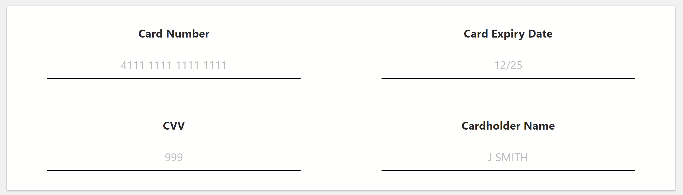
Example 1 continued
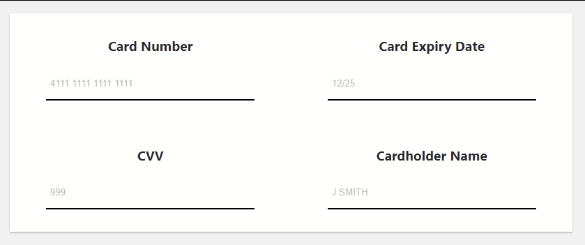
Continuing from the example above, using the same layout, the code to initialize the Hosted Fields using the previously defined layout would display as:
Sample JS
          window.controller = window.WindcavePayments.HostedFields.create(
          {
             env: "sec",
             fields: {
               CardNumber: {
                 container: "number-div",
                 tabOrder: 1,
                 placeholder: "4111 1111 1111 1111"
               },
               ExpirationDate: {
                 container: "expiration-date-div",
                 tabOrder: 2,
                 placeholder: "12/25"
               },
               CVV: {
                 container: "cvv-div",
                 tabOrder: 3,
                 placeholder: "999"
               },
               CardholderName: {
                 container: "cardholder-name-div",
                 tabOrder: 4,
                 placeholder: "J SMITH"
               }
              }
          },
          30,
            function () {
              console.log("Hosted Fields created");
            },
            function (errorMessage) {
              console.log(errorMessage);
            }
          );
This will construct the Hosted Fields elements in the designated containers and display as below:
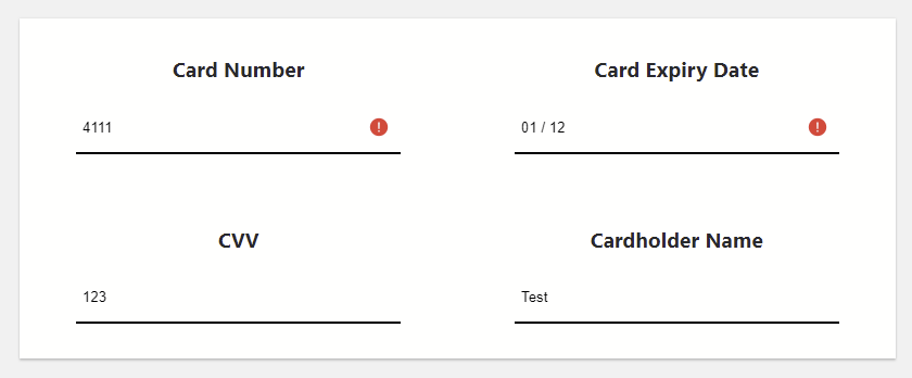
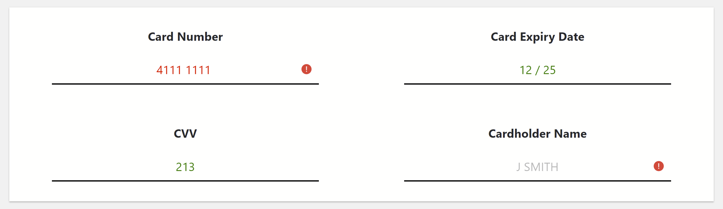
The validation would display when incorrect or incomplete data has been input, as below:
Styling
Hosted Fields allow styling on multiple levels as below:
- CSS level - When creating necessary elements, the Hosted Fields inspects the document stylesheet in search of specific classes. If found, the details within the classes are passed to the element to apply.
- Hosted Fields global level - When creating a Hosted Fields instance the merchant can pass the options.styles subobject that contains style definition that is applied to all the Hosted Fields elements.
- Element level - When creating a Hosted Fields instance the merchant can pass styles subobject for each individual field, thus providing an individual style definition for the corresponding element.
- appearance
- background-color
- box-shadow
- color
- direction
- font-family
- font-size-adjust
- font-size
- font-stretch
- font-style
- font-variant-alternates
- font-variant-caps
- font-variant-east-asian
- font-variant-ligatures
- font-variant-numeric
- font-variant
- font-weight
- font
- letter-spacing
- line-height
- opacity
- outline
- margin
- margin-top
- margin-right
- margin-bottom
- margin-left
- padding
- padding-top
- padding-right
- padding-bottom
- padding-left
- text-align
- text-shadow
- transition
CSS level
If the Hosted Fields global level styling is not provided, the Hosted Fields attempts to inspect loaded stylesheets to find styles of interest to apply to its created input element. These CSS class names as displayed below:
| CSS Class Name | Description |
|---|---|
| windcave-hf-focus | the style added to the Hosted Field container when the element is focused |
| windcave-hf-input | the base style for the Hosted Field input |
| windcave-hf-input-container | the style applied to the Hosted Field input container |
| windcave-hf-input-container-focused | the style applied to the Hosted Field container when the input gets the focus |
| windcave-hf-input-group | the style added to the Hosted Field group container (the DIV containing the field title as well as the Hosted Field and its inline error message) |
| windcave-hf-input-invalid | the style added to the Hosted Field input when it has been determined the input is invalid |
| windcave-hf-input-valid | the style added to the Hosted Field input when it has been determined the input is valid |
| windcave-hf-invalid | the style added to the Hosted Fields container when its input is invalid |
| windcave-hf-selector-dropdown-item-container | the style applied to the Hosted Fields selector drop down input item container. This one presently is only used for Shipping/Billing Country |
| windcave-hf-selector-dropdown-item-container:active | the style applied to the Hosted Fields selector drop down input item container when the item is being selected |
| windcave-hf-selector-dropdown-item-container:hover | the style applied to the Hosted Fields selector drop down input item container when the item is being hovered over |
| windcave-hf-selector-dropdown-item-image | the style applied to the Hosted Fields selector drop down input item image |
| windcave-hf-selector-dropdown-item-label | the style applied to the Hosted Fields selector drop down input item text |
| windcave-hf-selector-frame | the style applied to the Hosted Fields selector drop down list container |
| windcave-hf-valid | the style added to the Hosted Fields container when its input is valid |
In addition to the above, each individual element can have its own set of classes, as below:
| CSS Class Name | Description |
|---|---|
| windcave-hf-FieldName | The base style |
| windcave-hf-FieldName-invalid | The style when the input is invalid |
| windcave-hf-FieldName-selector-frame | The style of frame |
| windcave-hf-FieldName-valid | The style when the input is valid |
Where FieldName corresponds to the name from the fields subobject
The Hosted Fields allows to remap CSS class names for some of the occasions, if required. To action this, the merchant can specify options.styles.css subobject with the following fields:
| CSS Class Name | Description |
|---|---|
| input | The CSS class name to use in place of "windcave-hf-input" |
| input-valid | The CSS class name to use in place of "windcave-hf-input-valid" |
| input-invalid | The CSS class name to use in place of "windcave-hf-input-invalid" |
| selector-frame | The CSS class name to use in place of "windcave-hf-selector-frame" |
| selector-dropdown-item-container | The CSS class name to use in place of "windcave-hf-selector-dropdown-item-container" |
| selector-dropdown-item-container-hover | The CSS class name to use in place of "windcave-hf-selector-dropdown-item-container:hover" |
| selector-dropdown-item-container-active | The CSS class name to use in place of "windcave-hf-selector-dropdown-item-container:active" |
| selector-dropdown-item-label | The CSS class name to use in place of "windcave-hf-selector-dropdown-item-label" |
| selector-dropdown-item-image | The CSS class name to use in place of "windcave-hf-selector-dropdown-item-image" |
The same re-mapping is supported for individual fields. For this, the merchant needs to specify options.fields.FieldName.styles.css subobject with the same fields:
| CSS Class Name | Description |
|---|---|
| input | The CSS class name to use in place of "windcave-hf-FieldName" |
| input-valid | The CSS class name to use in place of "windcave-hf-FieldName-valid" |
| input-invalid | The CSS class name to use in place of "windcave-hf-FieldName-invalid" |
| selector-frame | The CSS class name to use in place of "windcave-hf-FieldName-selector-frame" |
| selector-dropdown-item-container | The CSS class name to use in place of "windcave-hf-FieldName-selector-dropdown-item-container" |
| selector-dropdown-item-container-hover | The CSS class name to use in place of "windcave-hf-FieldName-selector-dropdown-item-container:hover" |
| selector-dropdown-item-container-active | The CSS class name to use in place of "windcave-hf-FieldName-selector-dropdown-item-container:active" |
| selector-dropdown-item-label | The CSS class name to use in place of "windcave-hf-FieldName-selector-dropdown-item-label" |
| selector-dropdown-item-image | The CSS class name to use in place of "windcave-hf-FieldName-selector-dropdown-item-image" |
Hosted Fields global level
For additional flexibility on styling above the CSS level, the merchant can provide options.styles subobject to pass styling details. This subobject can contain the following fields:
| Subobject Name | Description |
|---|---|
| css | The subobject containing CSS class name remapping. Fields that can be included are:
|
| input | The subobject containing CSS attributes and their values to be passed into constructed elements and applied to their base style |
| input-valid | The subobject containing CSS attributes and their values to be passed into constructed elements and applied to their style when the input holds a valid value |
| input-invalid | The subobject containing CSS attributes and their values to be passed into constructed elements and applied to their style when the input holds an invalid value |
| selector-frame | The subobject containing CSS attributes and their values to be passed into constructed elements and applied to their drop-down list container |
| selector-dropdown-item-container | The subobject containing CSS attributes and their values to be passed into constructed elements and applied to their drop-down items base style |
| selector-dropdown-item-container-hover | The subobject containing CSS attributes and their values to be passed into constructed elements and applied to their drop-down items when the item is being hovered over |
| selector-dropdown-item-container-active | The subobject containing CSS attributes and their values to be passed into constructed elements and applied to their drop-down items when the item is being activated/selected |
| selector-dropdown-item-label | The subobject containing CSS attributes and their values to be passed into constructed elements and applied to their drop-down item labels |
| selector-dropdown-item-image | The subobject containing CSS attributes and their values to be passed into constructed elements and applied to their drop-down item images (if they are enabled) |
Below is a list of all fields that can be included in the CSS attributes subobjects:
- appearance
- background-color
- backgroundColor
- box-shadow
- boxShadow
- color
- direction
- font-family
- fontFamily
- font-size-adjust
- fontSizeAdjust
- font-size
- fontSize
- font-stretch
- fontStretch
- font-style
- fontStyle
- font-variant-alternates
- fontVariantAlternates
- font-variant-caps
- fontVariantCaps
- font-variant-east-asian
- fontVariantEastAsian
- font-variant-ligatures
- fontVariantLigatures
- font-variant-numeric
- fontVariantNumeric
- font-variant
- fontVariant
- font-weight
- fontWeight
- font
- letter-spacing
- letterSpacing
- line-height
- lineHeight
- opacity
- outline
- margin
- margin-top
- marginTop
- margin-right
- marginRight
- margin-bottom
- marginBottom
- margin-left
- marginLeft
- padding
- padding-top
- paddingTop
- padding-right
- paddingRight
- padding-bottom
- paddingBottom
- padding-left
- paddingLeft
- text-align
- textAlign
- text-shadow
- textShadow
- transition
For additional flexibility, each individual element can be styled by providing options.fields.FieldName.styles subobject.
The element level options.fields.FieldName.styles subobject can contain all the same fields as the global level options.styles subobject:
| Subobject Name | Description |
|---|---|
| css | The subobject containing CSS class name remapping. Fields that can be included are:
|
| input | The subobject containing CSS attributes and their values to be passed into constructed elements and applied to their base style |
| input-valid | The subobject containing CSS attributes and their values to be passed into constructed elements and applied to their style when the input holds a valid value |
| input-invalid | The subobject containing CSS attributes and their values to be passed into constructed elements and applied to their style when the input holds an invalid value |
| selector-frame | The subobject containing CSS attributes and their values to be passed into constructed elements and applied to their drop-down list container |
| selector-dropdown-item-container | The subobject containing CSS attributes and their values to be passed into constructed elements and applied to their drop-down items base style |
| selector-dropdown-item-container-hover | The subobject containing CSS attributes and their values to be passed into constructed elements and applied to their drop-down items when the item is being hovered over |
| selector-dropdown-item-container-active | The subobject containing CSS attributes and their values to be passed into constructed elements and applied to their drop-down items when the item is being activated/selected |
| selector-dropdown-item-label | The subobject containing CSS attributes and their values to be passed into constructed elements and applied to their drop-down item labels |
| selector-dropdown-item-image | The subobject containing CSS attributes and their values to be passed into constructed elements and applied to their drop-down item images (if they are enabled) |
Example continued
Continuing the previous example, by keeping the same layout and using only a global level styling, the code initializes the Hosted Fields using the previously defined layout would display as:
Sample JS
          window.controller = window.WindcavePayments.HostedFields.create(
          {
            env: "sec",
            fields: {
              CardNumber: {
                container: "number-div",
                tabOrder: 1,
                placeholder: "4111 1111 1111 1111"
              },
              ExpirationDate: {
                container: "expiration-date-div",
                tabOrder: 2,
                placeholder: "12/25"
              },
              CVV: {
                container: "cvv-div",
                tabOrder: 3,
                placeholder: "999"
              },
              CardholderName: {
                container: "cardholder-name-div",
                tabOrder: 4,
                placeholder: "J SMITH"
              },
              styles: {
                "input": {
                   color: "#222",
                   fontSize: "1.2em",
                   fontFamily: "'Segoe UI', Tahoma, Geneva, Verdana, sans-serif",
                   textAlign: "center"
                },
                "input-valid": {
                   color: "green",
                   fontSize: "1.2em",
                   fontFamily: "'Segoe UI', Tahoma, Geneva, Verdana, sans-serif",
                   textAlign: "center"
                },
                "input-invalid": {
                   color: "red",
                   fontSize: "1.2em",
                   fontFamily: "'Segoe UI', Tahoma, Geneva, Verdana, sans-serif",
                   textAlign: "center"
                }
              }
            },
            30,
            function () {
              console.log("Hosted Fields created");
            },
            function (errorMessage) {
              console.log(errorMessage);
            }
          );
This will add placeholders in the input fields as below:
The validation would display when incorrect or incomplete data has been input, as below:
Data Submission
Once Hosted Fields are ready and styling has been set up, the data needs to be submitted for processing.
To action this, the merchant needs to define an action point (i.e. button press), and call the method window.WindcavePayments.HostedFields.Controller.prototype.submit.
Important: This method is an instance method, not class method which means the method has to be called on the Hosted Fields controller instance that was returned during Hosted Fields construction.The interface WindcavePayments.HostedFields.Controller.prototype.submit method is as below:
WindcavePayments.HostedFields.Controller.prototype.submit(url, timeoutInSeconds, onResult, onError)
Where:
- url is the ajaxSubmitCard URL taken from Create Session response.
- timeoutInSeconds is a time in seconds the Hosted Fields will wait for all the components to finish data processing, submission and receiving the result. This parameter is optional. If omitted, the default timeout will be 30 seconds.
- onResult is a callback that is triggered once the submission is fully finished. The callback gets a single argument - status. If the processing does not require 3DSecure, then this callback will be triggered once with the status set to "done" . If 3DSecure is engaged, then the callback will be triggered twice - the first time with status set to "3DSecure" to mark the beginning of 3DS process, and the second time with status set to "done" to mark the end of processing.
- onError is a callback that is triggered when the submission process has failed. This callback gets called with a single argument - error, containing error details.
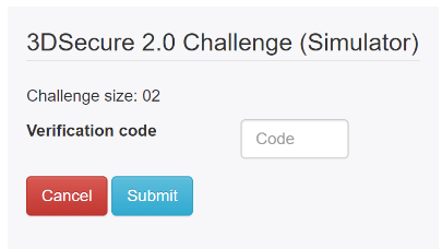
3DSecure
Hosted Fields can run 3D Secure if dictated by the transaction processing. If engaged, this will be displayed as a popup.
The styling of the pop-up is limited with the only changes possible are:
- Overlay color
- 3DSecure iframe dimensions
- Cancel button placement
Hosted Fields Controller References
As detailed above, the controller contains create and submit methods. Below details additional methods that merchants/integrators can use:
| Field Name | Description |
|---|---|
| submit (url, timeoutInSeconds, onResult, onError) | Triggers Hosted Fields data submission, where:
|
| validateField (fieldName, onResult, onError) | Triggers Hosted Fields data validation, where:
|
| submitWithAddressInfo (url, addressInfo, timeoutInSeconds, onResult, onError) | Triggers Hosted Fields data submission. This allows the merchant to supply shipping/billing information if obtained outside the Hosted Fields. The addressInfo is an object containing address details in the following format:
|